Planning:
I had purchased a day ticket to a brand new music festival 'Merthyr Rock' . I checked with the festival organisers that I was able to take my DSLR camera in with me and they agreed although I would not be able to be accredited and get access to the press pit to take photos.
I planned to try to take the following photographs:
- Site layout
- Food/merchandise stalls
- Activities
- Equipment
- Crowd shot
- Artist performance shots
As it was the first ever 'Merthyr Rock' festival, I was unable to research any layout images but I did research a few rock music magazines to try and get a feel for what types of photographs they use in their articles about live gigs and also what kind of cover shots they would use.
Equipment & Settings:
Camera: Canon EOS 1000D
Lenses: 24-135mm & 70 - 200mm
Shutter speed priority 1/100
ISO 200 - 1600
White Balance AUTO
Event:
Mock up magazine cover shot
 |
| I used the most 'rock concert' photograph I had to use as the cover image to tie in with the magazine theme. |
Magazine content
 |
| Site layout images give the reader the same first image of the festival as you would have attending the festival. |
 |
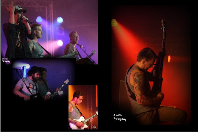
| The opening bands are on and the music starts.. |
With reference to my tutor feedback I have amended the original image above to make the images larger.
***
 |
| There are other activities available throughout the day |
Again, I have altered the above image to make the photographs larger and to fill in the black space as advised in my tutor feedback.
 |
| As the bands finish it's 'goodbye' till next year |
I decided to set the pages out as a double page magazine layout as opposed to doing a single portrait page for each 'page'. I wanted to lay the images out as a festival review and highlight not only what the bands performances were like through the images but also the highlight the overall festival if possible.
I have not undertaken any gig photography up until now but, having researched it online, I went into the festival knowing that the stage lighting would be a big issue to overcome, with it being inside a tent and therefore having no natural light at all. I thought this was really ironic seems as the most challenging chapter of this course for me was the light chapter, but looking at the final images I think I did really well.
I have also included a 'Merthyr Rock' title on the first magazine content page. I actually made this myself to include in this assignment. I took photographs of street and motorway signs to get the lettering and then edited them into individual letters before using online software to create the final title image.
Photographs used in magazine content:
References:
http://pixlr.com/
http://www.picnik.com/
http://www.hayfestival.com/merthyrrock/index.aspx?skinid=22
http://www.metalhammer.co.uk/
http://www.kerrang.com/
http://ishootshows.com/2008/07/16/choosing-lenses-for-concert-photography/
Tutor Feedback
Overall Comments
Thank you for sending me assignment five. I am very glad that you have enjoyed your course so much and agree that you have made lots of progress throughout the course. It was my pleasure to help you with your work. To submit your work for assessment you just need to contact the OCA and let them know. I don’t think you will need to do any extra work in preparation as your work has been so thorough. Good luck with your future photographic pursuits.
Feedback on assignment
The front cover of your magazine works really well, I like your tagline as well. It is important when taking photographs that you want to be used for a cover that there is enough blank space at the top for the title of the magazine and space at the sides for articles and such like and you have done this with this image.
Page one sets the scene well for what the festival is about, what the location is like etc. The images capture some of the festival goers and the atmosphere of the festival. The logo you made looks great!
Page two feels a bit like there is more blank space than images so I think that I would be inclined to make these images much bigger than they appear here. The images show more about the performers themselves, the equipment and the signage throughout the festival.
Page three feels a little more full but again I would make the images larger. The instruments and equipment here have a more backstage feel.
Page four works much better, really full page layout. I like the image of clapping which really gives more of a sense of the atmosphere of the crowds at the festival.
Page five again feels more full, the blue light gives a different feel to these images.
I like the mixture of colour and monochrome on page six, the photographs again fill the pages more and these photographs have more of a feeling of celebration with the colours and facial expressions.
Again these colours fill the page well, showing performance and lighting.
This final page has the feel of closing down of the festival but I think that you could have made more of this, maybe a wide show of the stage with an empty field in front to really show its all over. Maybe even showing the next stage, the clean-up operation?!
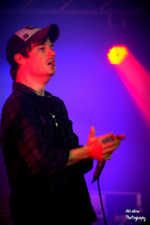
The photographs themselves are very good gig photography, particularly for your first attempt. You have gone in closely for all of your photographs of people and really captured expressions well. The shallow depth of field has ensured you can tell that the photographs are on stage and with coloured lights but not get distracted by the rigging and the lights themselves.
I like the variety in your shots that you have taken, the backstage and equipment photographs break up the photographs a bit and give a sense of the place and the festival itself.
I think my favourite shot has to be the clapping hands, you seem to have captured so much in this one image.
Tutor name: Celena Beech
Date 11.9.11
Next assignment due N/A
{END}


