Produce eight photographs of your chosen subject using different kinds of lighting. Aim to show the following qualities:
- Shape
- Form
- Texture
- Colour
Shape
 |
| 38mm F4 1/3 ISO 200 WB Shade |
 |
| 64mm F5 1/20 ISO 1600 WB Tungsten |
Form
 |
| 66mm F7.1 1/800 ISO 100 WB Daylight |
I chose a side and slightly higher camera angle to highlight the depth of the subject. I thought using a mirror would be fun too as this shows the subject from the back as well, giving a 360 degree view. This was taken in the shade in the mid afternoon on a sunny day. I dropped the exposure by -2/3 just to darken any lighter spots, mainly in the reflection in the mirror.
 |
| 56mm F11 1/100 ISO 100 WB Daylight |
Texture
 |
| 90mm F5.6 1/40 ISO 200 WB Shade |
 |
| 90mm F5.6 1/60 ISO 400 WB Auto |
Colour
 |
| 79mm F6.3 1/3 ISO 200 WB Auto |
 |
| 86mm F5.6 1/400 ISO 100 WB Daylight |
 |
| 80mm F5.6 1/60 ISO 400 WB Auto -2stop exp |
{END}
Tutor feedback
Tutor feedback
Overall Comments
Thank you for sending me the link to assignment 4. It is a challenging assignment and I think your photographs not only show that you understand the lighting techniques but also show experimentation and creativity.
Assessment potential (after Assignments 1 and 4)
I understand your aim is to go for the Photography Degree and that you plan to submit your work for assessment at the end of this course. From the work you have shown in this assignment, providing you commit yourself to the course, I believe you have the potential to succeed at assessment. In order to meet all the assessment criteria, there are certain areas you will need to focus on, which I will outline in my feedback.
Feedback on assignment
Shape
The photograph for shape has a real presence. You have used the lighting to make the vase look really strong and the viewpoint is interesting making it appear bigger in stature. I think this image looks great, I like the inclusion of the light behind the vase which gives almost a moonlike feel to the image. The background material also works very well in adding depth in the image.
I think that the second image is slightly less successful, it does show the shape but there are other elements such as colour and pattern shown here also so this makes shape appear to be less of a focus and on looking at this image it wouldn’t be the first thing that you think of as the subject. Also the composition seems a little bottom heavy.
Form
This images works well to show form, the mirror seems to emphasise the sense of it being a three dimensional object. I always think a good way to tell if an image shows form well is if you almost feel like you could pick up the object out of the image and I think that you have achieved this here. The angle of viewpoint in this image and the depth of the field make it a more interesting composition.
The second image doesn’t feel so much that it shows form nevertheless I like the idea of the image, particularly again the viewpoint and the fact that you have not felt the need to show the whole of the object.
Texture
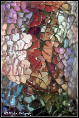
The texture of the crackled glass comes across very well in these images, I like the fact that you have gone in really close to fill the frame with these almost abstract textures. Changing it to black and white was a good idea to really focus on textures and nothing else.
Colour
This first image is full of colour, It really shows a different quality to the vase to any of the images before and is a nice surprise to see how vibrant the vase is! Very well lit to avoid reflections or glare and an excellent, simple composition.
The second is also successful, I like the angle of view and the slight distortion and blurring of the reflection against the real vase. Being out of focus seems to emphasise the colours even more.
This third image is a really happy accident, The colours appear gemlike and sparkly as these coloured dots, a beautiful image.
Learning Logs/Critical essays
Your learning log documents all of the exercises very thoroughly.
Pointers for the next assignment
Try to put everything in place that you have learned so far. I look forward to seeing your final piece of work.
Tutor name: Celena Beech
Date 25.8.11
No comments:
Post a Comment